What this is — and what it is not
This documents a design study: research plus a set of directions for how ollwrite should look and feel. Every image below is a high-fidelity HTML mockup — a depiction of the intended surface, not the shipping app. The real editor today is still the generic shadcn/Plate scaffold. The build step (restyle the real app to the chosen direction) is bounded and comes later; see §06. The product itself — its money path, endpoints, and reuse map — lives in the build-ready spec and the functional-product write-up.
01The thesis — premium is the inversion of every generic tell
The demo we started from looks like a thousand AI editors because it kept every default: a full width text column, one blurry font doing both prose and buttons, a persistent toolbar hovering over the writing, pure-black text, a generic blue, no focus state, and instant, symmetric fades. Premium is not a coat of paint on that — it is inverting each tell on purpose.
| Generic tell | The premium inversion |
|---|---|
| Full-bleed text, any width | A sacred reading measure — prose locked to ~66 characters, the line length typographers have used for centuries. |
| One font for everything | Two hard type registers — Source Serif for the writing, Inter for every UI chrome. They never blur into each other. |
| Persistent hovering toolbar | No toolbar at all — actions appear on selection / on demand; the page is the writing, nothing else. |
Pure black #000 on white | Warm near-black #26231C ink on warm paper — reads like print, not a terminal. |
| A loud, generic blue | One restrained accent, used sparingly — a single considered voice, not a rainbow. |
| No sense of concentration | A focus / flow mode — the room dims to the sentence you are in. |
| Instant, symmetric fades | Sub-300ms asymmetric motion — things ease in slower than they leave, the signature of considered software. |
Identity, not isolation. ollwrite owns its own face — but it shares oll.am's DNA: the Source Serif body and a blue in the #567B95 family, so it reads as a member of the family, not a stranger.
The editor should feel like good paper, not a dashboard.
02Four aesthetic directions
Four coherent takes on that thesis, each explored as a full mockup. They are not mutually exclusive — the recommendation (below) blends two.
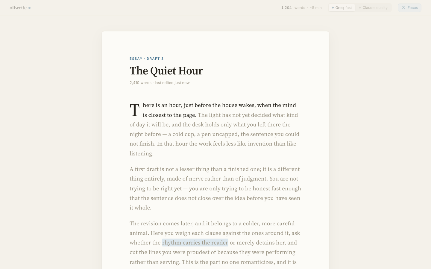
Manuscript default · hero
Warm-editorial light. The desk-in-morning feel: cream page floating on a warmer room, a proper drop-cap, generous margins, the reading measure held sacred. The safest, most legible everyday surface.
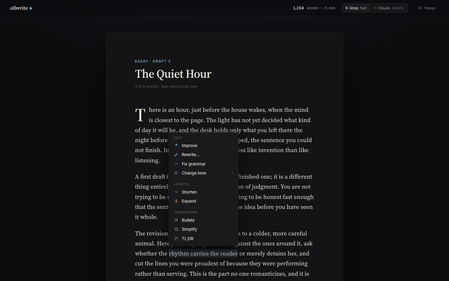
Nocturne dark
Cinematic, lamp-lit dark. Not an inverted light theme — a genuinely nocturnal room where a single lamp falls on the page. Warm off-white ink on near-black, the accent lifted to a luminous blue so it glows rather than shouts.
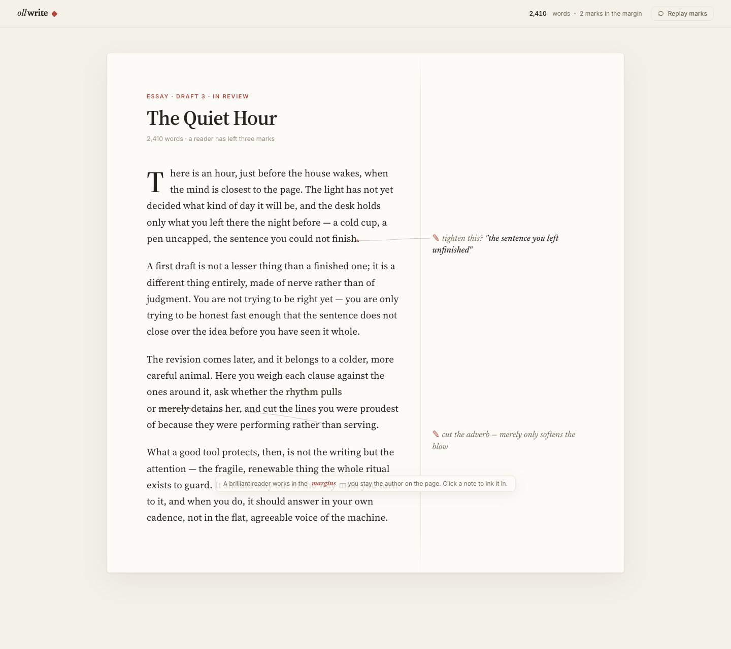
The Margin recommended model
AI as a respectful red-pencil editor. Suggestions live in the margin — a note in the editor's hand beside your line — never rewriting over you. This makes the honest-tool ethic visible: the AI advises, you decide, you stay the author. The strongest interaction model of the four.
Impression materiality
Letterpress, ink-on-paper. The most tactile direction: type that sits pressed into the page, subtle deboss on accepted text, a galley/proof feel. Brings physical materiality to a screen surface — the reason a suggestion feels like it was printed, not injected.
The recommendation
The Margin's interaction model + Impression's materiality. Ship Manuscript as the default light surface and Nocturne as its dark twin, but adopt The Margin as the way the AI behaves (margin-note suggestions, author stays in control) and borrow Impression's letterpress press for the accept moment. That combination is what produces the signature below.
03The signature moment — “The Ink-In”
Every product people love has one moment they screenshot and describe to a friend. Things has the paper-fold when you complete a to-do; Arc has the confetti on a new tab; iOS has the rubber-band scroll. ollwrite's is the Ink-In.
What happens
You accept an AI suggestion. It does not pop in. The proposed text arrives as faint graphite, then inks — the ink spreads along the line the way a fountain pen wets paper — and the margin note that suggested it dissolves, its job done. On Impression, the freshly-inked text settles with a faint letterpress deboss. Sub-300ms, eased-in, transform/opacity only.
Why it's the ownable brand moment: it makes ollwrite's entire ethic literal. The suggestion was always in the margin — advice, not authorship. When you accept, you are the one committing it to the page; the AI's note steps back and disappears. “AI advises, you stay the author” stops being a tagline and becomes something you can watch happen. It is warm, physical, honest, and unmistakably ours — a single animation that no generic shadcn editor can copy without copying the whole philosophy behind it.
Design rule
The Ink-In is the one place ollwrite spends motion budget lavishly. Everywhere else, motion is near-invisible restraint (§04). This asymmetry — almost no motion, then one beautiful commit — is itself the signature.
04The design system
Two type registers, one warm palette (with a Nocturne dark set), and a strict motion budget. Everything here is expressible as tokens.
Type — two hard registers
| Role | Family | Spec |
|---|---|---|
| Prose | Source Serif 4 | 19px / 1.7, measure locked to 66ch |
| UI chrome | Inter | 13px — every button, label, meter, menu |
Serif prose and sans UI never blur into each other — that separation is half the premium feel. (This study's own docs stay in the oll.am house registers — Playfair / Source Serif 4 / Source Sans 3 — while the product uses Source Serif + Inter.)
Palette — Manuscript (light)
| Page | #FCFBF7 | the sheet you write on |
| Room | #F4F1EA | the warmer surface the page floats on |
| Ink | #26231C | warm near-black — never #000 |
| Secondary | #6B6455 | metadata, muted UI |
| Accent | #3F6E8C | the single voice — an oll.am #567B95-family blue |
| Selection | #DCE7EE | the calm highlight behind a selected phrase |
Palette — Nocturne (dark)
| Room | #0B0B0D | the darkened room |
| Page | #141416 | the lamp-lit sheet |
| Ink | #E8E4DA | warm off-white — reads as paper, not glare |
| Accent | #7FB4D4 | the accent lifted so it glows in the dark |
Motion — a strict sub-300ms budget
| Enter | opacity + scale .95 → 1 | 180–220ms, cubic-bezier(0.16,1,0.3,1) |
| Exit | faster, asymmetric | 150ms — things leave quicker than they arrive |
| Properties | transform / opacity only | never layout; every transition <300ms |
| Accessibility | gate everything | honor prefers-reduced-motion |
All buildable on the stack we already use
Nothing here needs a custom editor. It sits on Plate.js — native ghost-text (the margin/graphite suggestions), word-diff (the review surface), and streaming-preview plugins — with Motion driving the Ink-In and the enter/exit budget. The design is ambitious; the implementation is off-the-shelf.
05The product surface — a whole product, not just an editor
A premium editor is table stakes; a premium product needs every surface around it to hold the same bar. The study mocks the complete inventory, so the restyle has a target for each screen — not just the writing canvas.
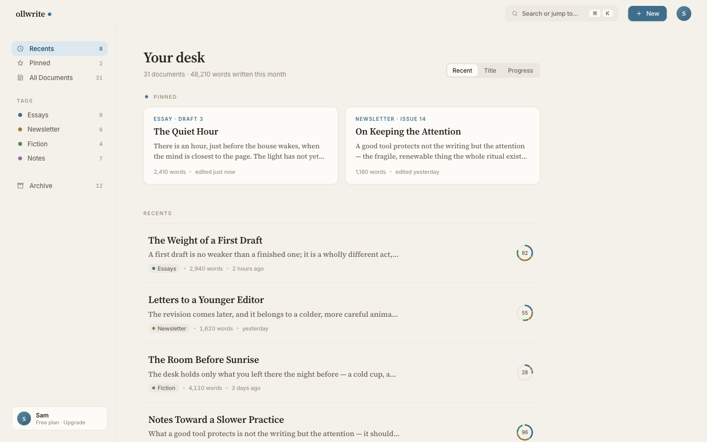
⌘K search/jump palette, and a quiet Free plan · Upgrade card. Proof ollwrite is a full product surface — this is a mock, one of the nine inventoried above. High-fidelity HTML mockup.06How to view it — and the bounded next step
The full mockups are high-fidelity HTML in the ollwrite repo at design/mockups/, served locally during this session at http://localhost:4321. The four screenshots above are captured from them. They are design depictions — and as of 2026-07-02 the first increment (Manuscript + focus) has shipped onto the real /editor; see §07 for the full build sequence.
The next step is bounded, not open-ended
Turning the chosen direction into the real app is a contained restyle job, not a rebuild:
- Kill the toolbar — move actions to on-selection / on-demand.
- Apply the tokens — the two type registers + the Manuscript/Nocturne palettes + the 66ch measure.
- Add focus mode — dim the room to the current sentence.
- Add the real ✨ menu — wired to the existing write-service op set.
- Add the Ink-In — the accept animation on Plate ghost-text + Motion.
Everything under the fold — the 13-endpoint writing engine, Core auth, the model toggle — already exists and is dev-tested. This study only decides how it should look while it does that.
07From design to build — the launch
The study is no longer just Figma. We mapped every ollwrite interaction → its write-service endpoint → the Plate.js mechanism, then split the restyle into six phased increments. Increment 1 is shipped on the real /editor (dev-verified, not yet deployed); the rest are sequenced below.
| # | Increment | Status |
|---|---|---|
| 1 | Manuscript design system + focus mode — cream floating page, Source Serif prose at 66ch, Inter UI, warm ink #26231C, accent #3F6E8C, the persistent Plate toolbar removed, the quiet idle-dimming top bar (wordmark · live word count · Groq/Claude toggle · Focus), and ⇧⌘F focus mode (dims all but the active line — block-level in this Plate build). |
✓ SHIPPED dev-verified · not deployed |
| 2 | Premium ✨ menu + word-diff + the Ink-In accept — the grouped on-selection command menu (Edit · Length · Transform) with a word-level diff preview and the signature Ink-In accept animation (§03). | next |
| 3 | Ghost-text via CopilotKit + new /api/write/continue — continue-from-cursor inline suggestions, repointed off today's direct Groq call onto a new gated write-service verb. |
planned |
| 4 | The Margin — marginalia mode — the recommended interaction model (§02): AI suggestions as red-pencil notes in the margin, dissolving on accept via the Ink-In. | planned |
| 5 | Product surface — library / ⌘K command palette / onboarding / upgrade (§05): the whole product, not just the canvas. | planned |
| 6 | Core auth ON + deploy — flip magic-link auth on, plan-gate the model toggle, ship to a stable write.oll.am. |
planned |
Write-service gaps flagged by the mapping
The 13 stage write-service endpoints cover everything else. Two gaps surfaced: (1) a new /api/write/continue endpoint — continue-from-cursor for ghost-text; today's ghost-text hits Groq directly and un-gated, so it must be repointed onto Core-gated write-service (Increment 3); (2) an optional dedicated grammar verb — the ✨ menu's “fix grammar” currently reuses rewrite; a purpose-built verb would tighten it.
Increment 1 is real — the /editor now wears the Manuscript design
The real ollwrite /editor (standalone local repo, on its master) was restyled to the Manuscript surface: the floating cream page, the sacred 66ch measure, two type registers, the removed toolbar, the idle-dimming top bar, the grouped ✨ selection menu, and block-level focus mode (⇧⌘F). It stays fully wired to the write-service — a real Groq op round-trip is verified, and npm run build is green. Design depiction has become shipping app for the first slice.
/editor (dev-verified, not deployed); increments 2–6 are sequenced in §07. Four directions explored as high-fidelity HTML mockups; recommendation locked (The Margin's model + Impression's materiality, on Manuscript light / Nocturne dark). Increments 2–6 are the bounded follow-on. Product substance: the spec · the functional product. Sequencing unchanged — the Backlog stays the order of record; the first stranger franc comes first.