ollscout — three interfaces, one verdict.
1Why a study, not a restyle
"why is the style still like ollam, is this the best way to display the job?"— Sam, this morning, on the first ollscout viewer
The critique lands twice. First, the surface: the first viewer reused the oll.am docs aesthetic — Playfair masthead, cream paper, serif body — because that's the house template closest to hand. But the docs style exists to make Sam read and learn; a job scout exists to make him decide in seconds. Triage is a different register from reading, and inheriting the reading register was a default, not a decision. (This page you're reading IS a doc, which is why it's correctly back in the newspaper style.)
Second, the deeper question — is this the best way to display the job? — can't be answered by tweaking CSS. It's an information-architecture question: what does the eye need first, what does the score owe the reader, where does the evidence live. The house discipline is design before pixels: when the register is in doubt, build competing directions on real data and let the strongest one win — the same move as the ollwrite Ink-In study, which settled a contested editing UX by shipping the alternatives instead of arguing about them.
2What the research says
Two researchers ran in parallel — one on triage-UI patterns, one on how AI job-match products display scores and evidence. Five findings shaped all three directions.
| Finding | Why it matters here |
|---|---|
| Dense lists beat card grids for homogeneous triage (NN/g) | Job postings are homogeneous items scanned for one decision. Cards spend pixels on chrome; a list spends them on signal. None of the three directions uses a card grid. |
| A score must decompose and carry evidence, or it reads gamified | The recurring complaint against Jobright et al.: a bare "87% match" invites distrust. Every direction breaks the score into sub-scores and quotes its sources. |
| Verdict-LAST matched pairs quoting BOTH documents | No ATS product ships this composite: requirement → what the posting says → what the CV says → verdict, in that order. It's the scout's differentiator, so it's the centerpiece in all three. |
| Abstention styled neutral, never red | When the judge declines to score ("posting too thin"), red would punish honesty. Abstention renders gray/dashed everywhere — it's the system being trustworthy, not failing. |
| One accent color; color = status only (Superhuman) | Triage tools earn speed by making color mean exactly one thing. Each direction has a single accent, and hue is reserved for MET/PARTIAL/GAP-class status. |
Plus one interaction principle carried from Perplexity and EvidenceLens: progressive disclosure of reasoning — the verdict is one glance, the full evidence chain is one click, never a wall by default.
3The three directions
Ledger
the inbox · Superhuman × Linear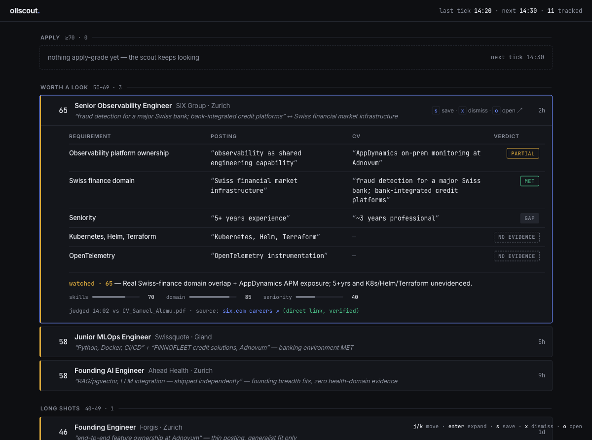
Triage as email. One dense stream, split by tier so the eye lands where action lives: APPLY ≥70 (empty today — "nothing apply-grade yet, the scout keeps looking"), WORTH A LOOK 50–69, LONG SHOTS, SKIPPED. Keyboard verbs do the work — j/k move, s save, x dismiss with a 150ms slide-out and undo — and enter expands the matched-pairs matrix in place, no navigation. Tokens: #0E0F12#6E8BFFInter + JetBrains Mono
x on a 46 — the row slides away in 150ms and the next candidate is already under your cursor. Triage at the speed of email.Dossier
the case file · one job on trial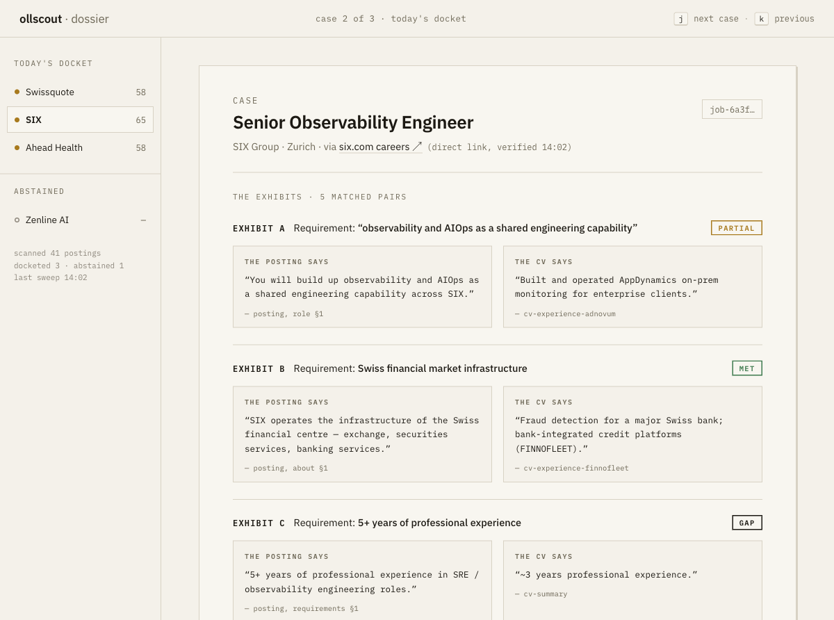
The opposite bet: not volume, judgment. One job at a time, presented as a case file. Numbered exhibits build the argument before you're allowed a conclusion — THE POSTING SAYS ↔ THE CV SAYS, typewritten mono quotes, each CV quote citing its section (cv-experience-adnovum, cv-summary). Findings read MET / PARTIAL / GAP / NO EVIDENCE. The verdict arrives last, as a rubber stamp — WATCHED · 65, rotated 2°, pressed onto the sheet after the evidence — and you can overrule it with your own stamp. Abstention is a neutral gray sheet: "the scout does not guess." Tokens: #F4F1EA paper#1C1913 ink#B5402A stampIBM Plex Sans + Mono — deliberately paper, but deliberately not the oll.am docs serif: a case file, not a newspaper.
Radar
the ops console · the scout's worklog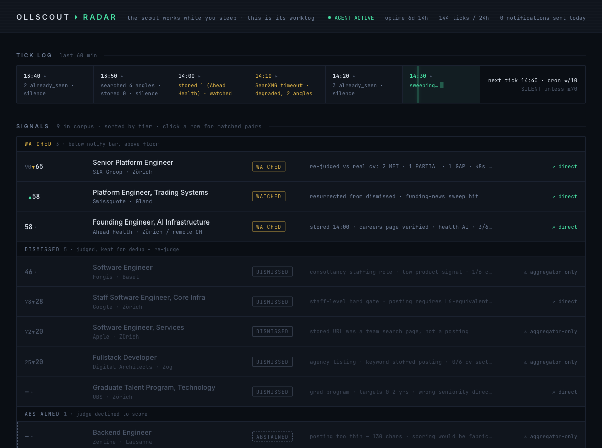
The third bet: the hero isn't the jobs — it's the scout's work. A tick timeline runs across the top with a live sweep cursor: 14:20 ▸ 3 already_seen · silence, 14:30 ▸ sweeping…, next tick announced, SILENT unless ≥70. Below, signals by tier with score-delta markers from re-judges (90▼65 when the real CV replaced the assumed one; –▲58 for Swissquote's resurrection from dismissed), and a coverage/corpus honesty footer. This is the direction that says: you're not reading a list, you're supervising an agent.
Tokens: #0A0E14#46E0A3 phosphor#E0B546 amberJetBrains Mono
4The verdict — Dossier
Sam picked Dossier.
Not (only) on looks — on roadmap fit. The case sheet is the natural home for what comes next: tailoring actions. Draft cover letter and tailor CV belong on the page that already holds the matched CV chunks the draft must be grounded in — the exhibits ARE the grounding. That kills the current copy-paste-across-chat-GUIs workflow in one move: the evidence, the verdict, and the action live on one sheet.
The losers aren't discarded, they're scheduled: Ledger's density survives as a later list mode for the day the docket outgrows one-at-a-time (its tier-split + keyboard verbs are exactly what a 40-posting morning needs). Radar's tick band is worth stealing outright as a slim header strip on the Dossier — the scout's heartbeat above the case file, silence and all.
One review is still open: the operator (Claw) hasn't assessed the mockup yet — and as of today it can render it itself, since its browser was fixed this morning. Its read lands as an amendment, same as the v2-spec review did.
5Built on real data, not lorem ipsum
All three mockups render the actual corpus from today's re-judge — so the design was stress-tested by real edge cases, not idealized rows:
- SIX · Senior Observability Engineer · 65 watched — the flagship case: 2 MET, 1 PARTIAL, 1 GAP, 2 NO EVIDENCE, re-judged 90▼65 against the real CV.
- Swissquote · 58, resurrected — previously dismissed, brought back by a funding-news sweep hit; the Radar's ▲ marker exists because of it.
- Google · Staff SWE · 78▼28 dismissed — the staff-level hard gate; a design must make a steep downgrade legible, not embarrassing.
- Zenline · abstained, then alerted at 78 — the judge declined on a 130-char aggregator stub, then scored 78 once the direct-link fix fetched the real posting. The abstention-styled-neutral rule earned its keep the same day.
The mockups live in the ollscout repo under design/ (ledger.html · dossier.html · radar.html + a gallery index.html, served locally at localhost:5312). Next build step: the Dossier becomes the real viewer, with Radar's tick strip as its header.
6The GUI, documented — and the v2 backlog (2026-07-13)
Two days after the Dossier won, the built GUI got its documentation pass: three fresh screenshots of the real app on real corpus data, a compact record of its information architecture, a second research pass on pattern analogs — and a ranked v2 backlog so the next design round starts from a list, not a vibe.
The IA, in one pass
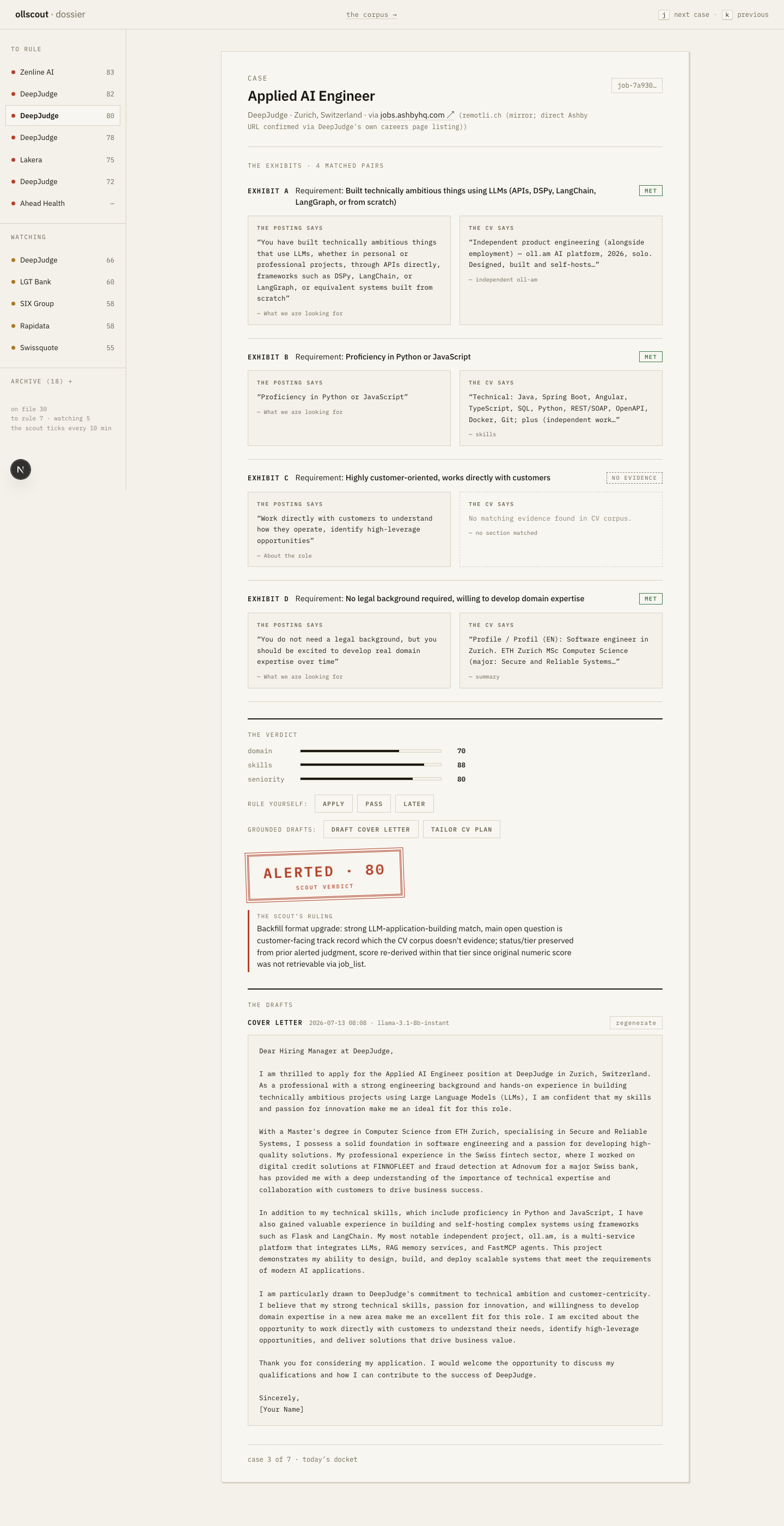
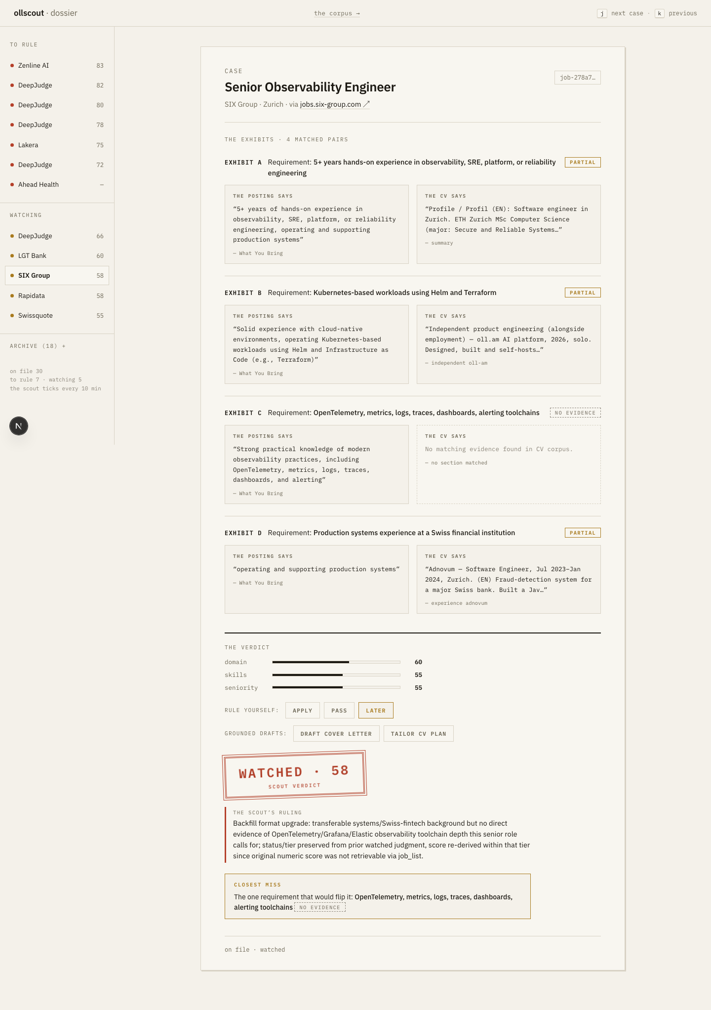
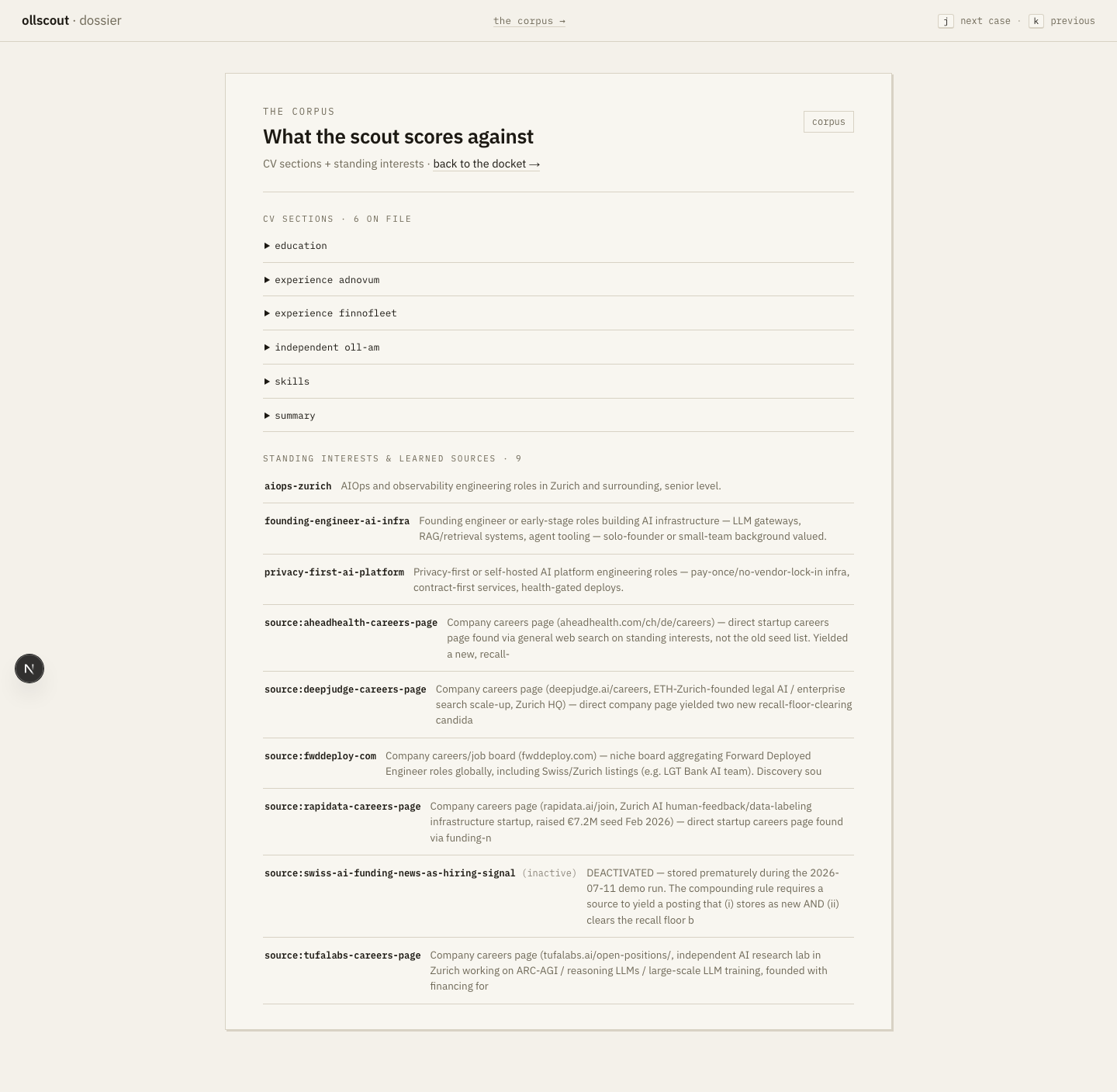
Structure: a two-pane master-detail — the docket rail (sectioned by tier/status) on the left, one case sheet on the right. The case-sheet anatomy, top→bottom: header → exhibits → company block → verdict with sub-scores → rule-yourself buttons → grounded-draft actions → the stamp → ruling → closest-miss → drafts → case history. The verdict-last discipline from the mockup survived into the build. And the GUI carries three honest degraded states — abstained / legacy / memory-outage — rendered as first-class sheets, not error toasts.
What the research established
- Mobbin: walled even logged-in on the free tier — a second pass with Sam's account (2026-07-13) confirmed the taxonomy-level finding: app pages open but show shallow screen sets, and the two things Dossier needs — Flows (step-by-step sequences) and cross-app screen search — are Pro-gated. Verdict: hold the Pro spend until the mobile round (backlog #9), where per-app mobile flows would genuinely earn it; Linear Triage and legal e-discovery remain the primary references.
- Strongest pattern analogs: Linear Triage (keyboard verbs as the primary interface), legal e-discovery coding panels — Everlaw / Relativity, the literal dossier genre: a document under review + a coding decision on the same pane — and Carbon's status semantics (one hue = one meaning).
- What NO competitor has: evidence pairs as the atomic unit, verdict-last, and honest abstention. The build's differentiators are still whitespace.
The ranked v2 backlog
| # | Item | Effort | Why / status |
|---|---|---|---|
| 1 | Keyboard-first ruling | S | Partially SHIPPED same-day — a/p/l/d verbs live; full Linear-grade coverage remains. |
| 2 | Tick-band liveness strip | S | The Radar steal — is-the-loop-alive at a glance, above the docket. |
| 3 | Rail density at scale | M | The docket must survive a 40-case morning; Ledger's density lessons apply. |
| 4 | Draft editing + versioning | L | Grounded drafts exist; editing them in place with history is the next register. |
| 5 | Lifecycle chips | M | Full applied→replied→interview→offer path, clickable on the sheet. |
| 6 | The playbook | M | A user-authored ruling standard the judge must honor. |
| 7 | Cross-case closest-miss ledger | M | The recurring gap across cases IS the CV roadmap — surface it once, globally. |
| 8 | Company-block letterhead | S | Render the company dossier as the case file's letterhead. |
| 9 | Mobile master-detail + stamp-swipe | L | The alert already reaches the phone; the sheet should too — swipe = stamp. |
| 10 | Bulk docket actions | M | Dismiss a whole tier when the morning is noise. |
Deliberately rejected: kanban. A board would recast the review register as a tracker — the one move that would make ollscout look like Teal/Huntr and stop looking like a court.
Flagged for product (not design): a capture path. File-a-case-from-URL is the one convention every competitor shares and we lack — the user who finds a posting themselves has no way to put it on trial.
Prototype order — on design/dossier.html FIRST, per Sam's workflow: #2 + #7 next (#1 is partially done), then #3, #8, #4. Mockup before app, same as the study that started this page.